Manta Air
Brand Identity
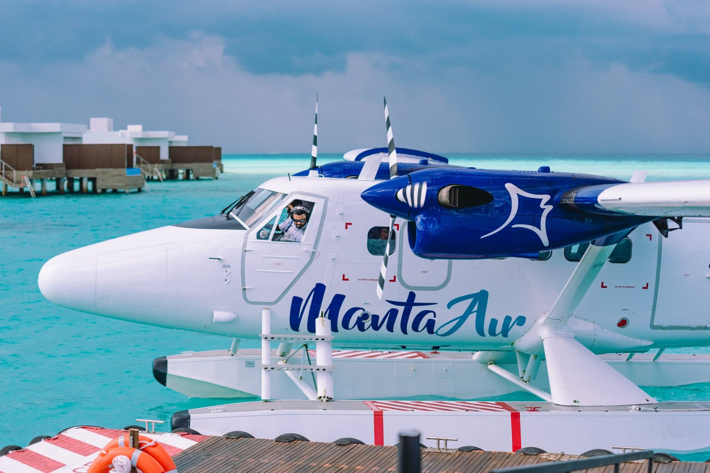
Crafting a brand new brand identity for Manta Air — the new experience in the skies of the Maldives.
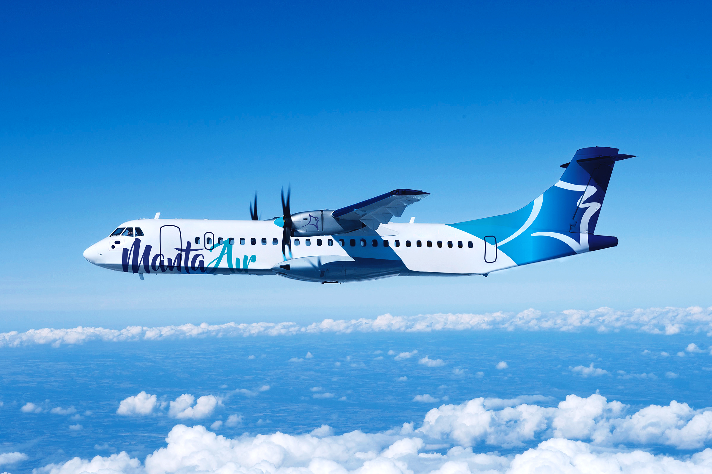
Prior to the creation of Manta Air, in the Maldives, there was no flight operator that offered a consistent and reliable air transfer service. Frequently late or unavailable, this negativity was transferred to the resorts who had to pay the price as they were seen as responsible.
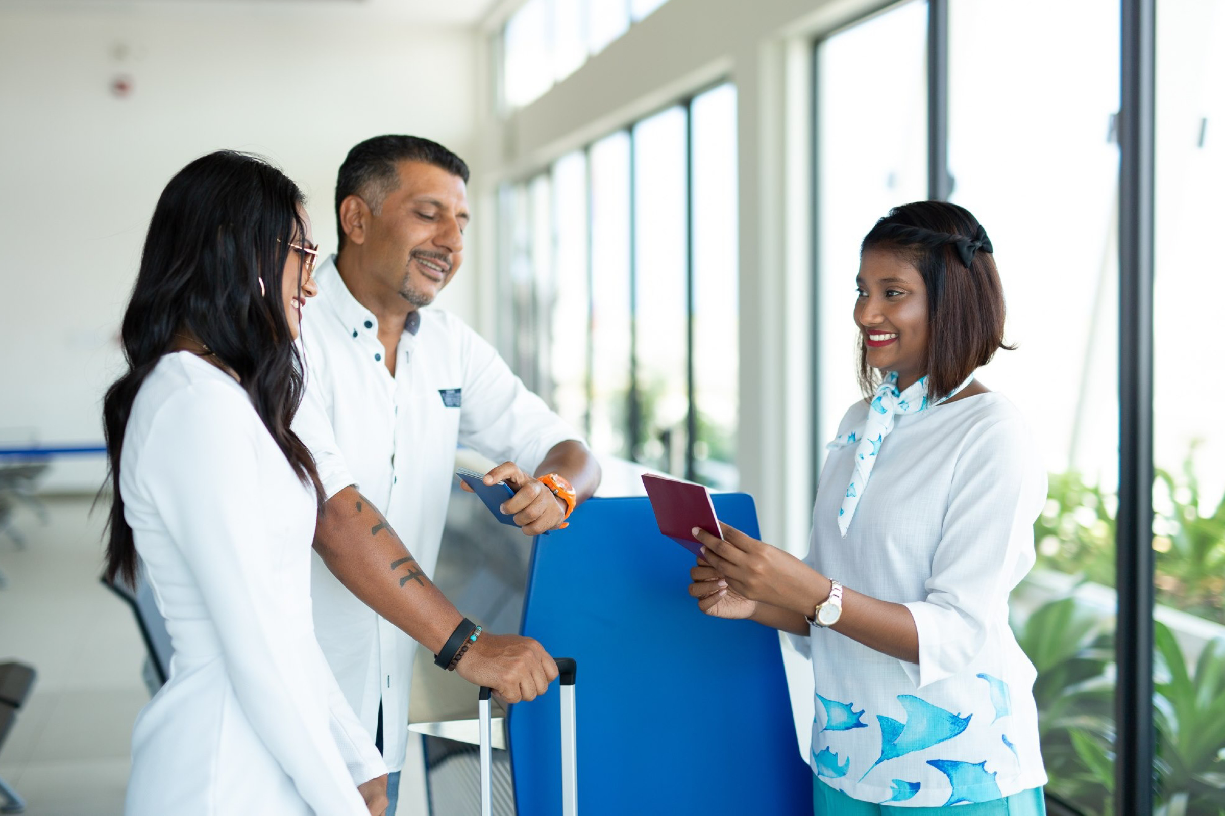
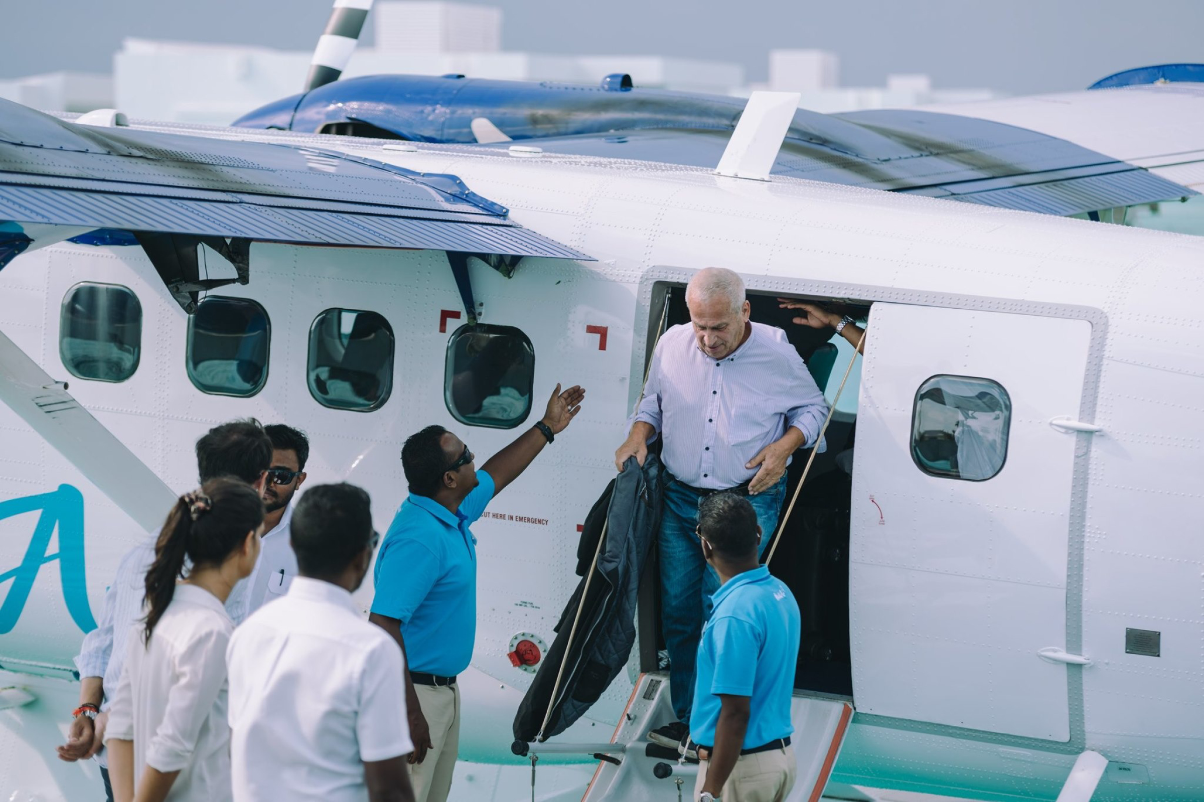
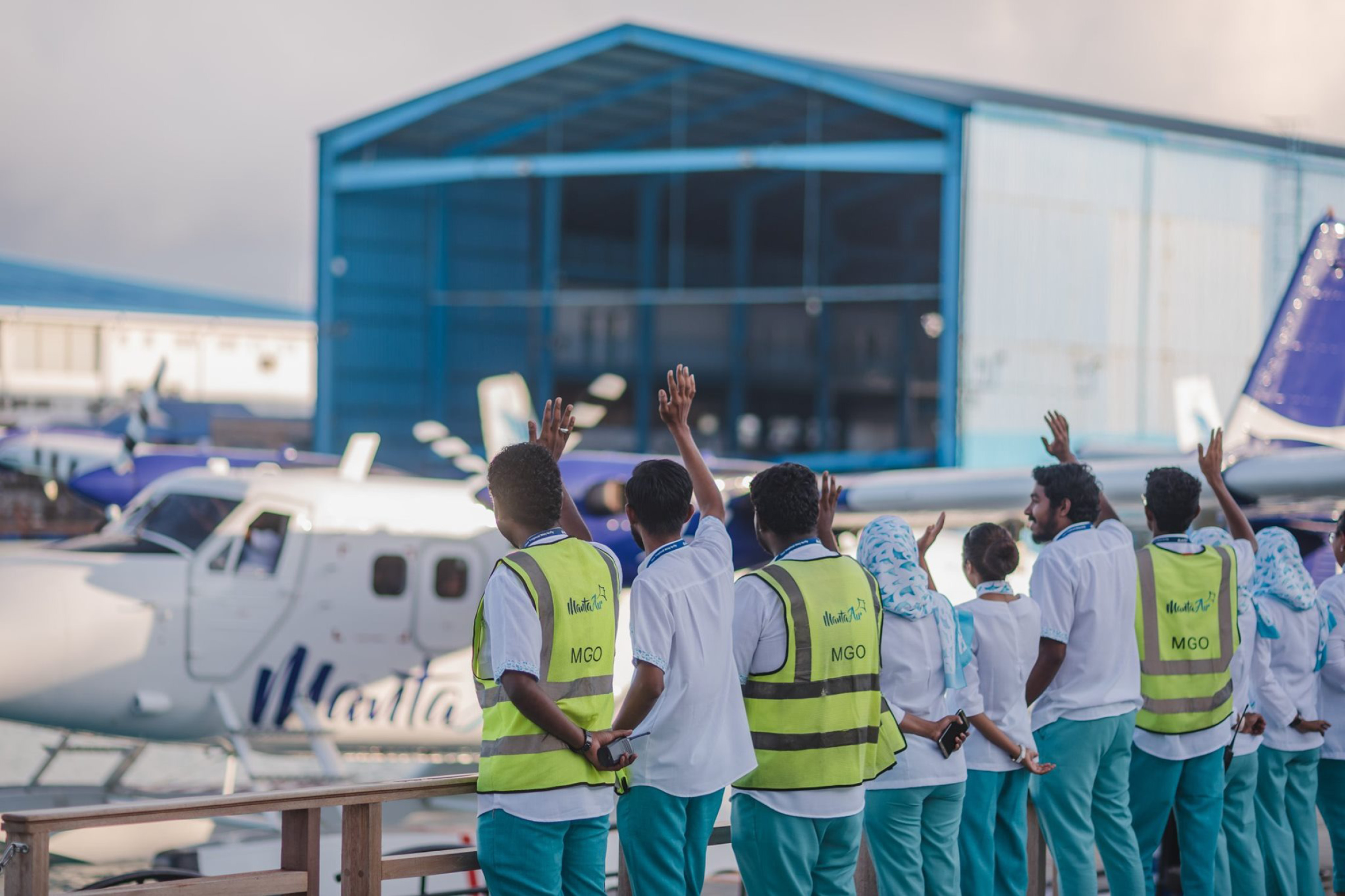
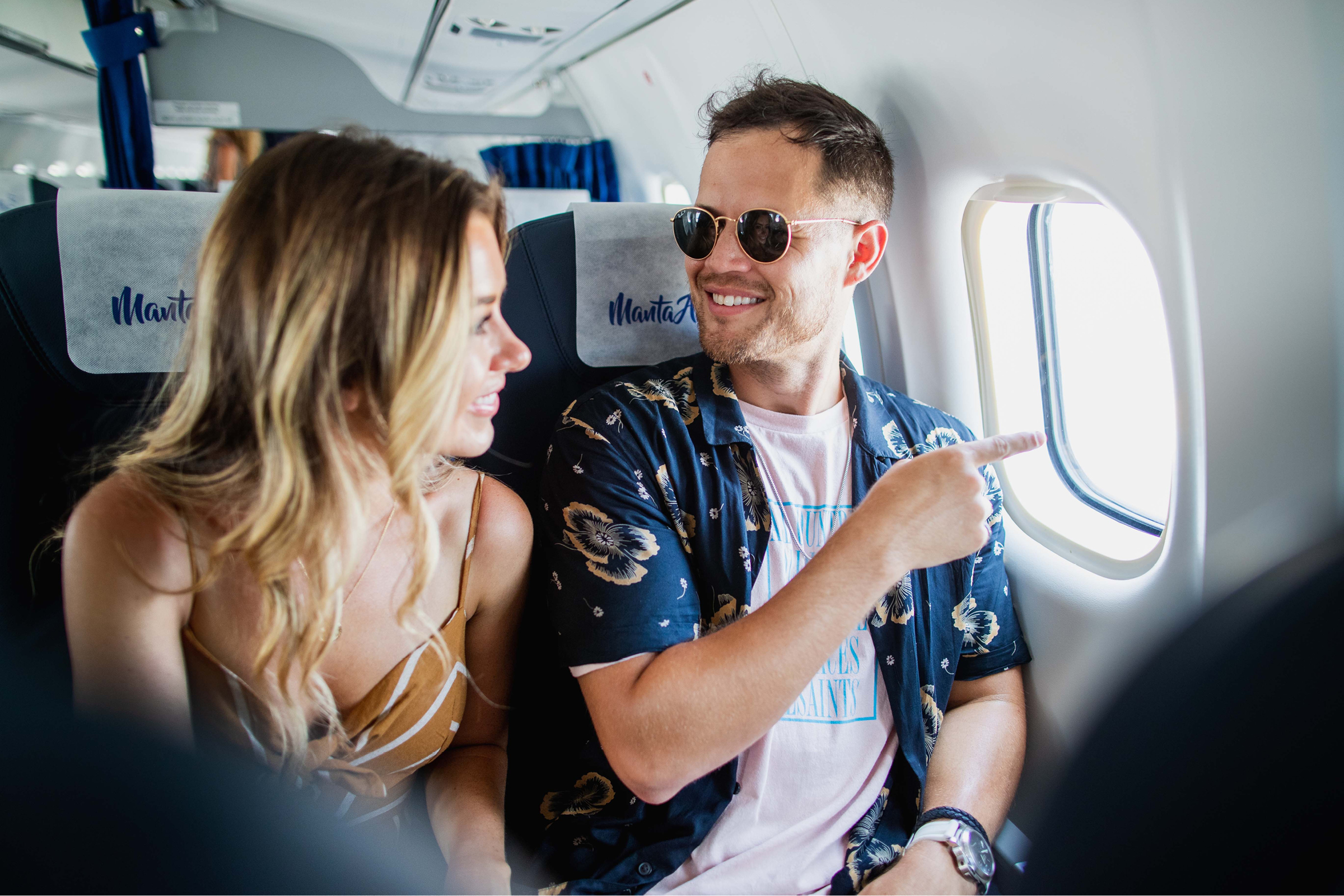
Manta Air brought together the best crews and planes, and worked out a new service offering that “takes the trouble out of travel; so that you and your loved ones spend more time on vacation and less in transit.” The program focused on the harmonisation of the customer journey and that it is seen as a forward projection of the hospitality experience – so that ‘guests’ feel their vacation beginning from their departure (and not their arrival).
This was a joint project together with Equus Design Consultants and the consortium shared the responsibility and developed the entire brand foundation from scratch. The scope of work included brand strategy with Brandcourage’s Brand DNA®, brand creation as well as brand expression, from communications to uniforms, plane livery to inflight magazines.
Credits
Brand strategy
Colin Anderson
Creative direction
Chew Kok Hsiung
Andrew Thomas
Brand design
JY Foo
Lim Teng Hong
Eng Chun Pang
Project management
Florian Lüthi
"Manta Air takes the trouble out of travel; so that you and your loved ones spend more time on vacation and less in transit."
BRIEF
The owners of the large resorts were frustrated with the poor service provided by the local transport companies that brought their guests from the main airport to the resort islands — often they were late and underwhelming — so the client bought the best of the planes available; hired the best pilots and began to look at how the lobby experience of their 6-star resorts could be applied to making their guests enjoy their transfer instead of hating the hotel operator.
RESPONSE
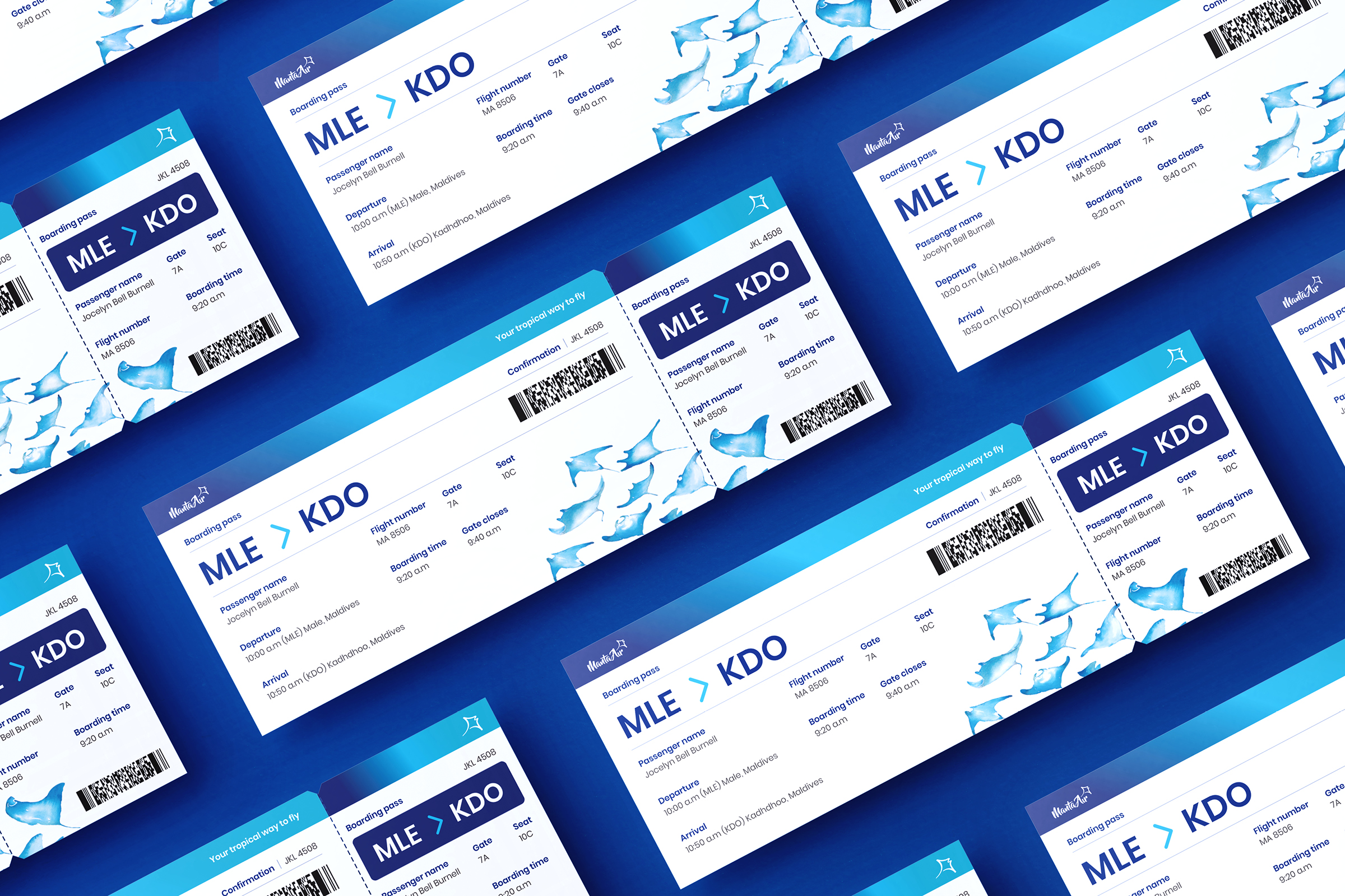
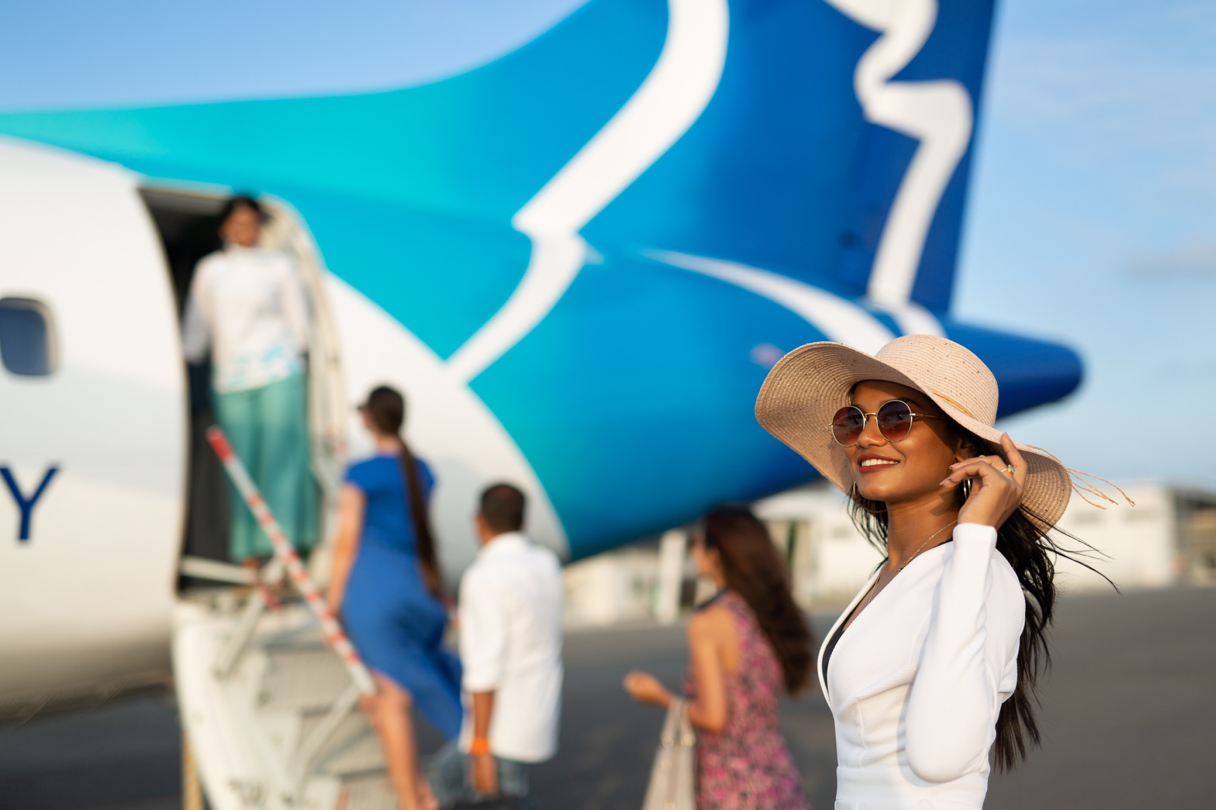
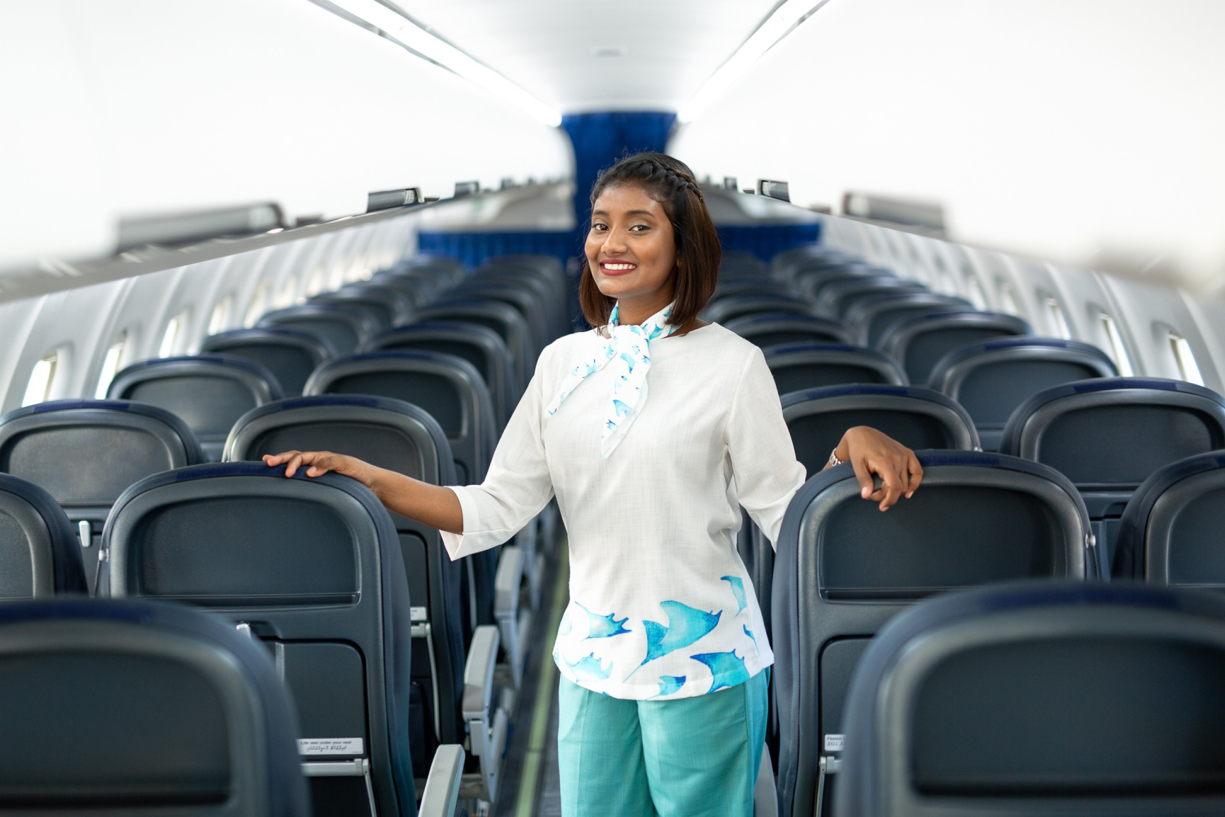
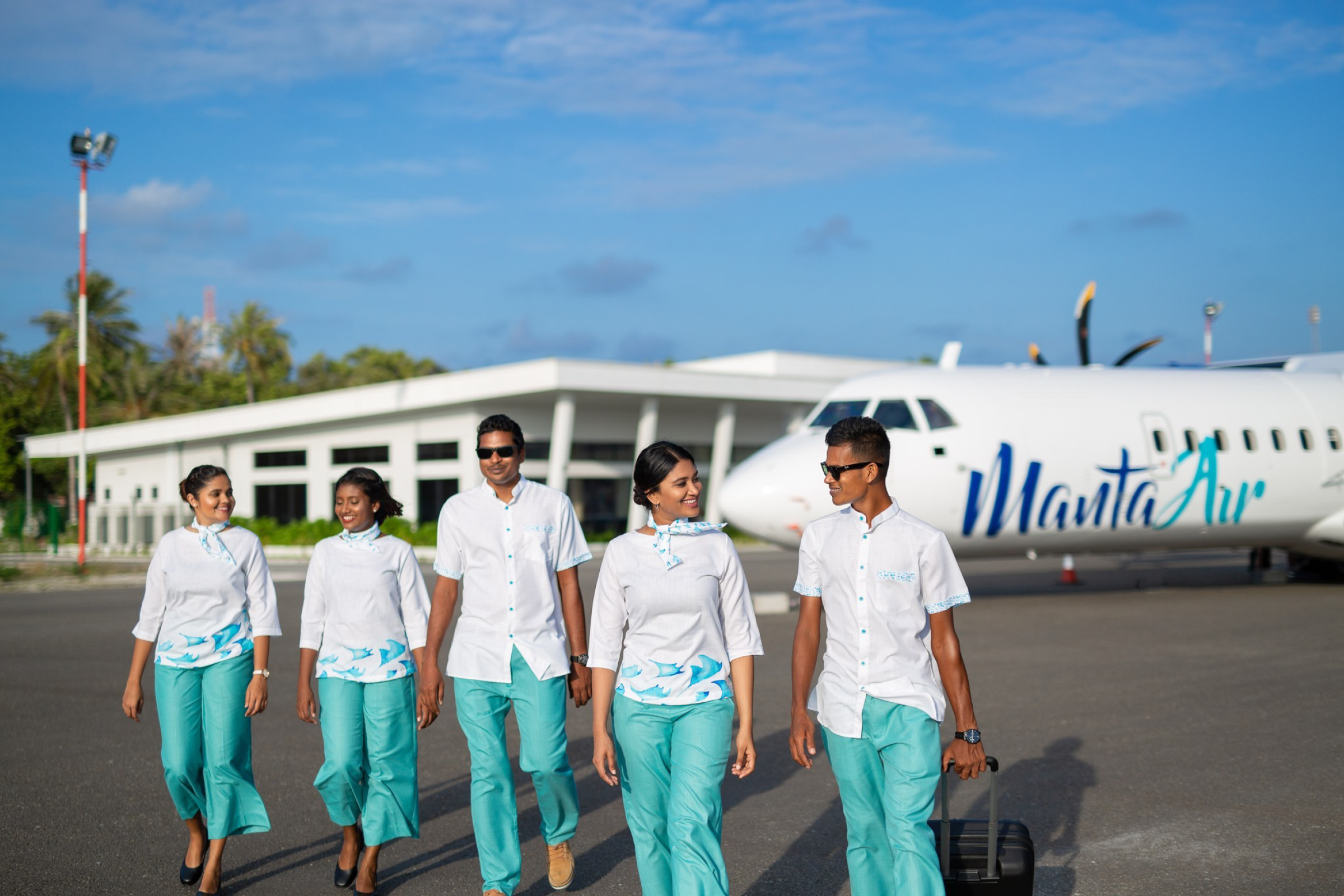
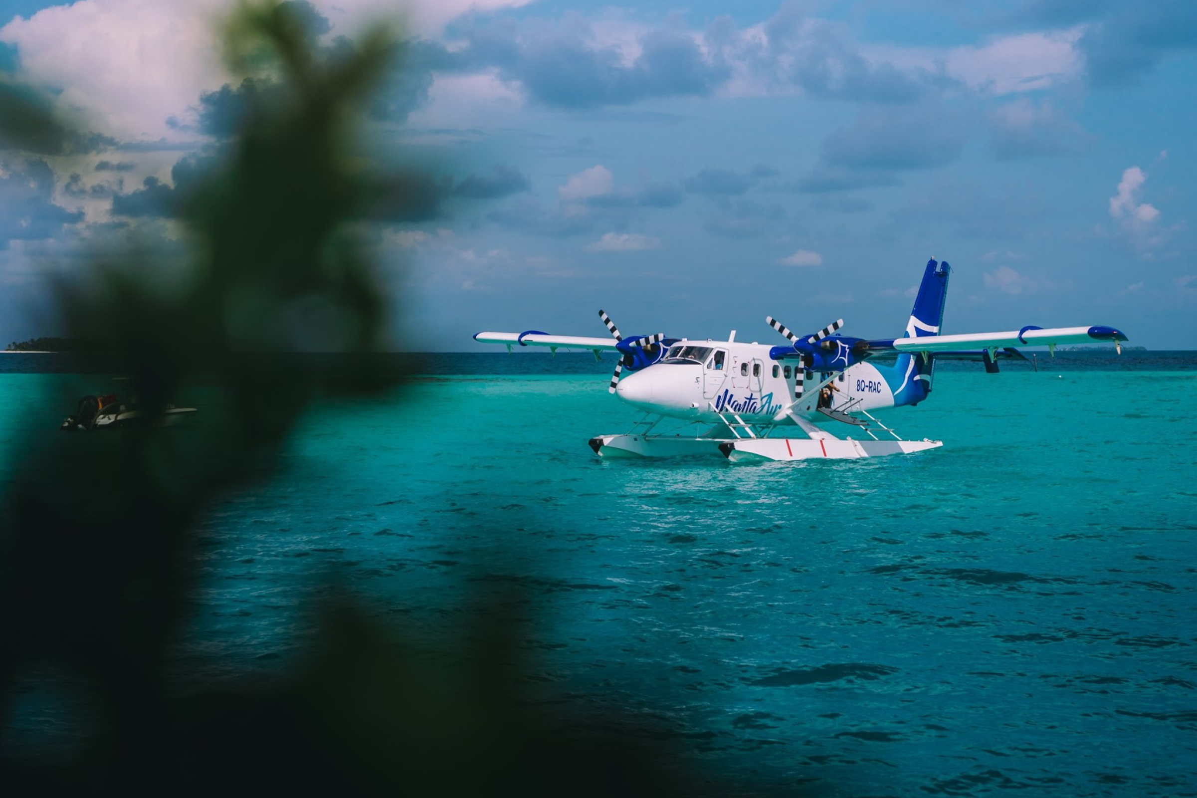
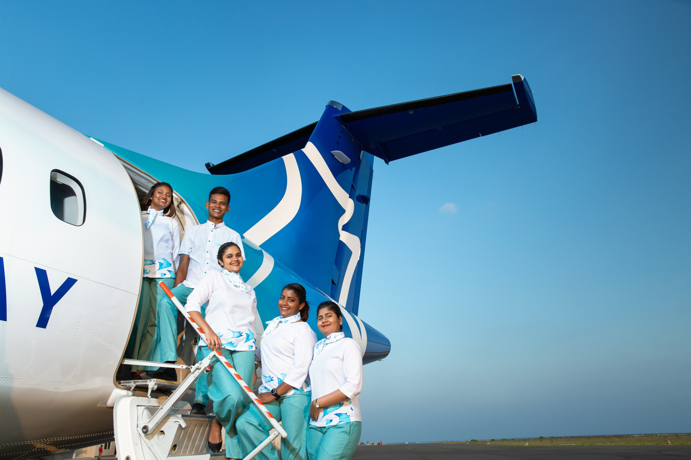
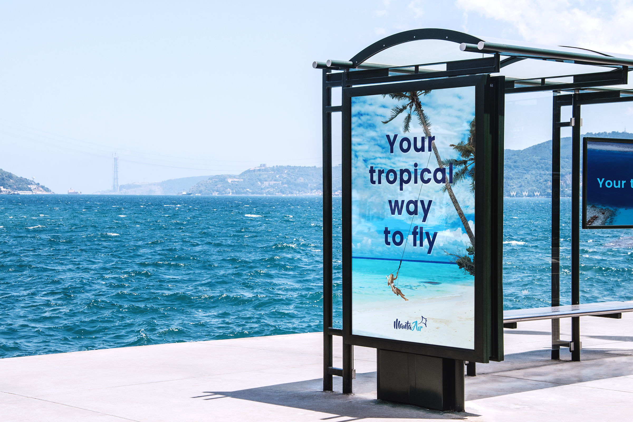
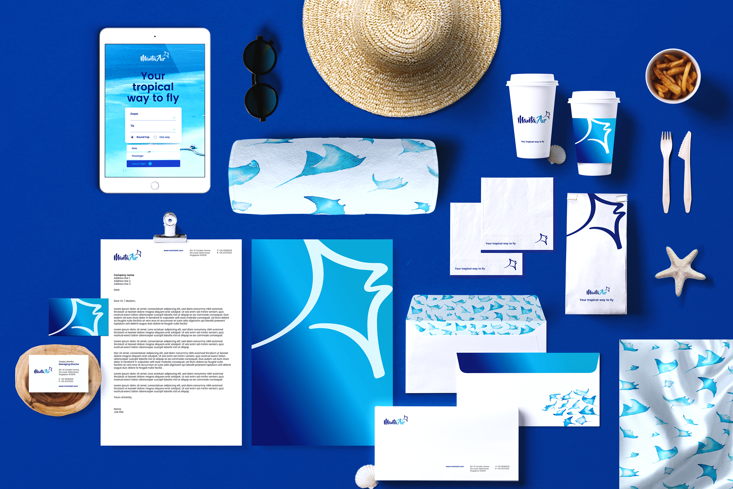
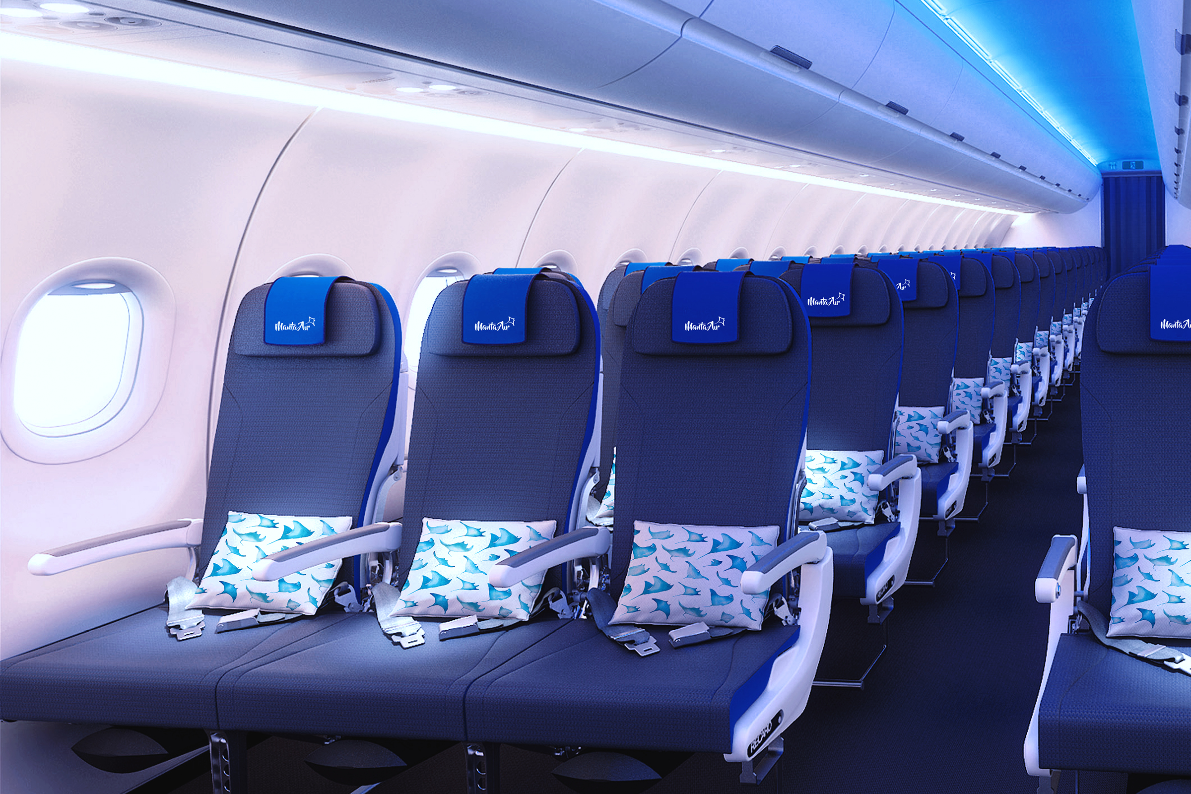
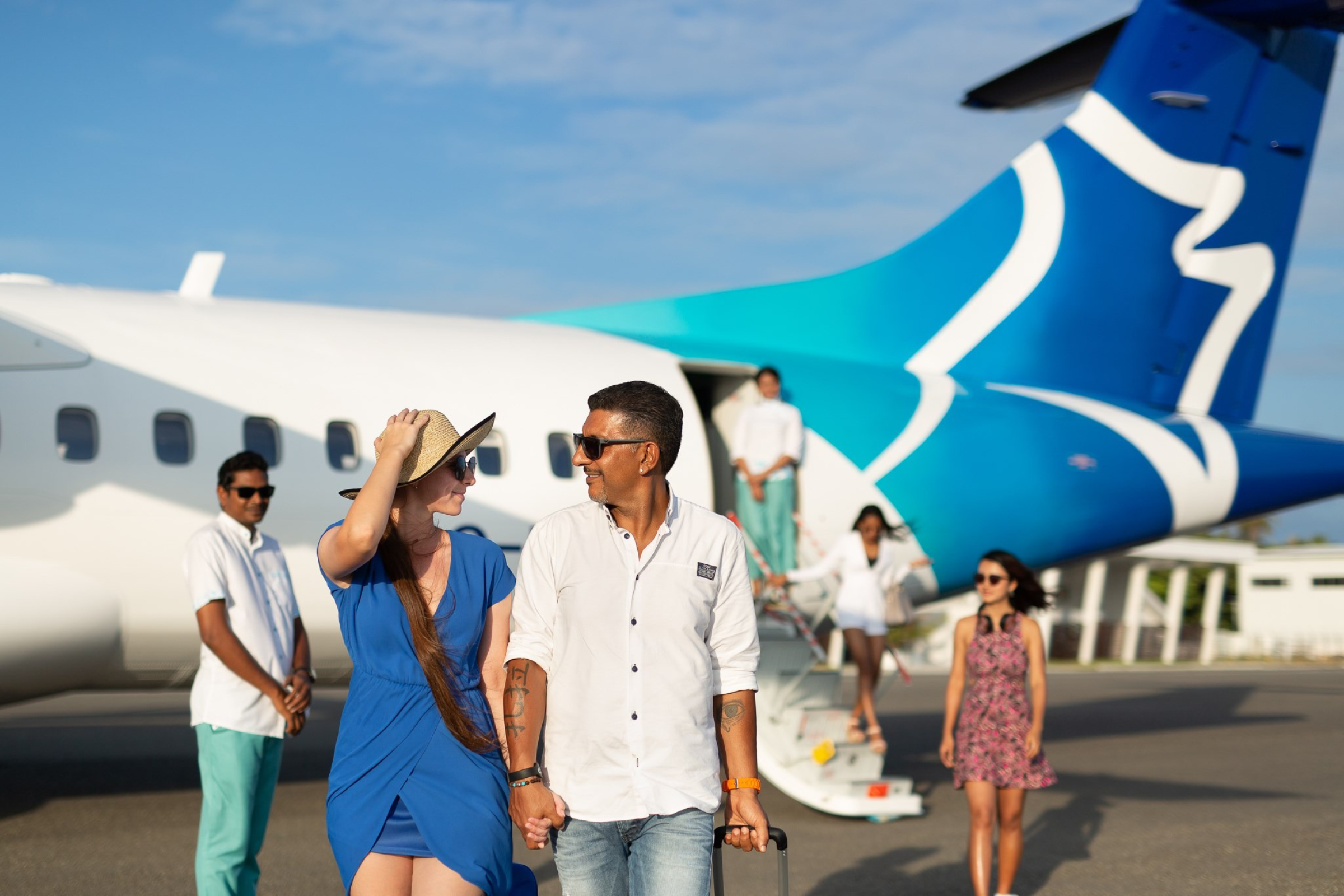
The client came up with the name “Manta Air” and told us that they didn’t want a manta (in the logo) — so we gave them two instead. The graphic interruption became an integral element of the Brand DNA® which promised “Your tropical way to fly”, this was extended into the bright and cheerful uniforms, decor and livery (the second manta was in the water colour renderings) that became their visual and verbal language.
"Trust our reliability. It is second to none. With many decades of experience in hospitality, we understand that being on time is essential. It means that our guests start their holidays with a smile."
