Saffron Collection
Brand Identity
Brand refresh for Saffron Collection — a curation of privately owned hotels.
The Saffron Collection is a curation of privately owned hotels, each a unique creative expression that presents compelling stories of people and place, giving our guests a contemporary experience with a hint of nostalgia.
In an ever more complex yet cookie-cutter world, guests are seeking originality and a level of elegance that is desirable because it is so unique. The Saffron Collection moves beyond design clichés and celebrates an authentic, stylish lifestyle in each setting.
Imbued with the timeless tales of the properties and characters that created them, The Saffron Collection is recognised as an ambassador of culture, mesmerising travellers from all over the world with the soul of each hotel.
Credits
Creative direction
JY Foo
Brand design
JY Foo
Project management
Florian Lüthi
Consultation
Florian Lüthi
Chew Kok Hsiung
"We create memories for all our guests through thought-provoking design & architecture and integration into the local scene."

BRIEF
The owners were frustrated with the brand inconsistencies throughout the partnership with different privately owned hotel owners. So the client brought us on board to stylise and update their current branding for existing and future hotels and resorts in their collection.
RESPONSE
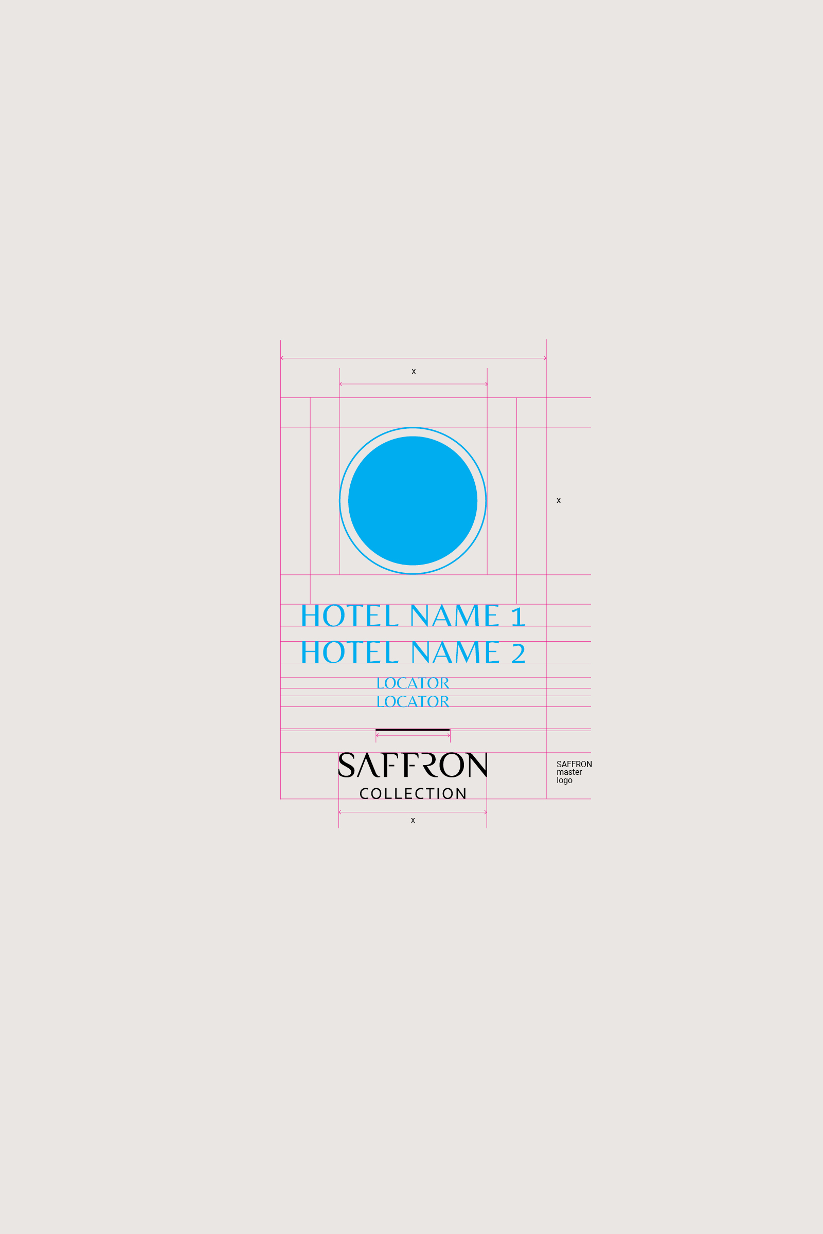
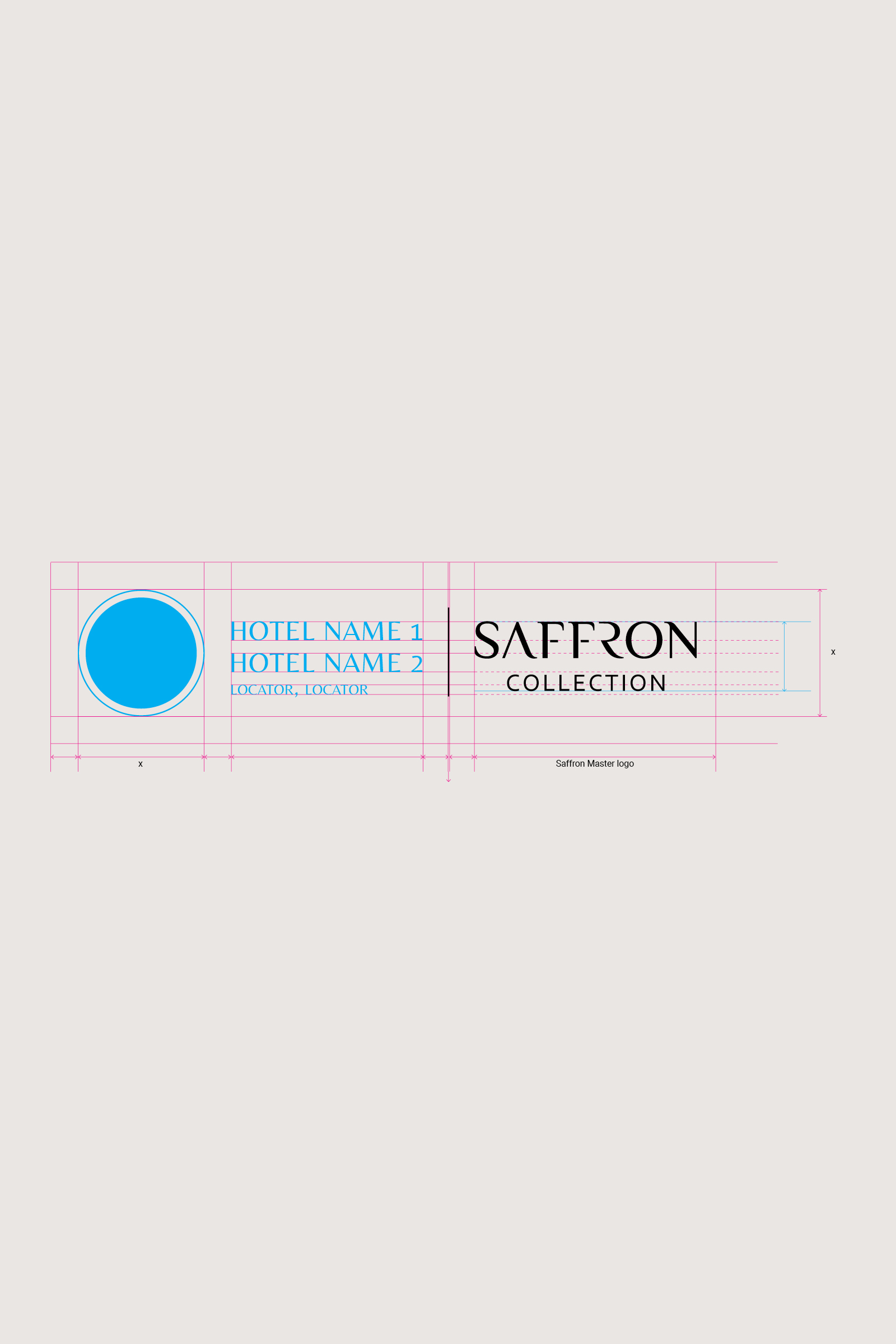
Coming up with a brand and logo system for future brand applications to bring them into a common visual language.
On a property level, the Saffron Collection logos feature three distinctive elements:
(i) Top: Hotel icon
(ii) Center: Hotel name and locator
(iii) Bottom: Saffron Collection master logo.
BRAND COLOURS
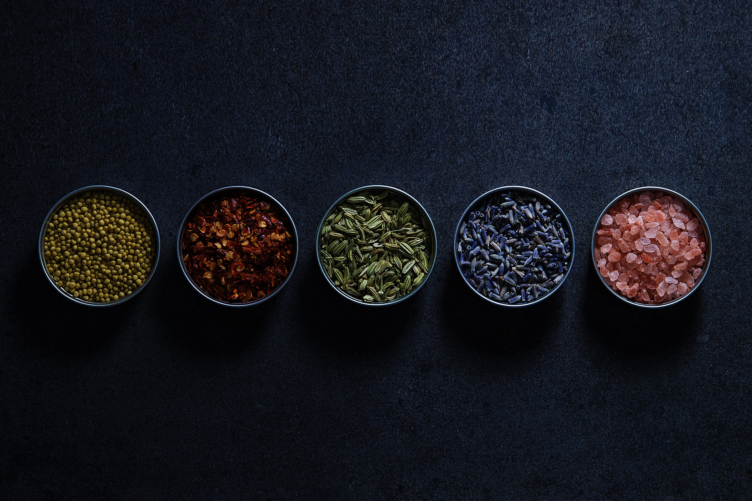
Saffron itself is an exotic spice derived from the flower of Crocus sativus, commonly known as the "saffron crocus". The Saffron Colour Palette originates from the world of spices and exotic flavours to represents the collection of stories the brand collected across the world. In brand management, the consistent use of colour is a powerful tool to trigger recognition and remembrance.
All the colours were carefully curated to bring visual harmony across all the brand communications.
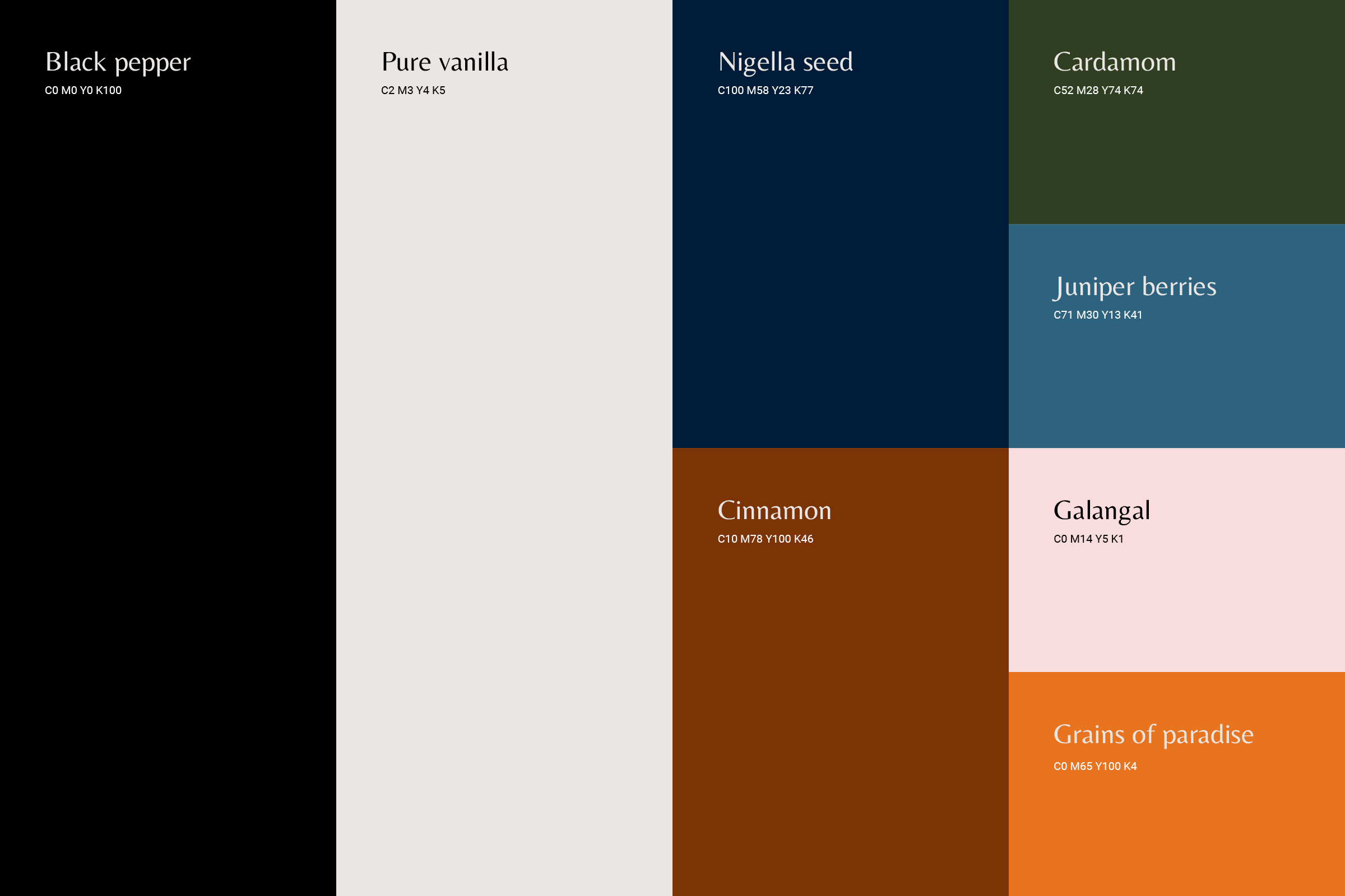
“An old European wax seal, or Asian chop is the inspiration of the logo lockup, or rather the iconic round shape of it. The notions of trust and authenticity are what makes this symbolism a valuable asset in the Saffron Collection brand identity.”
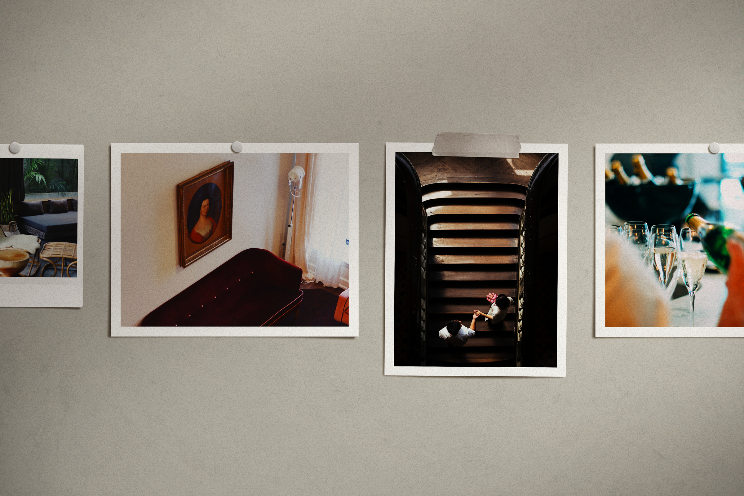
PHOTOGRAPHY STYLE
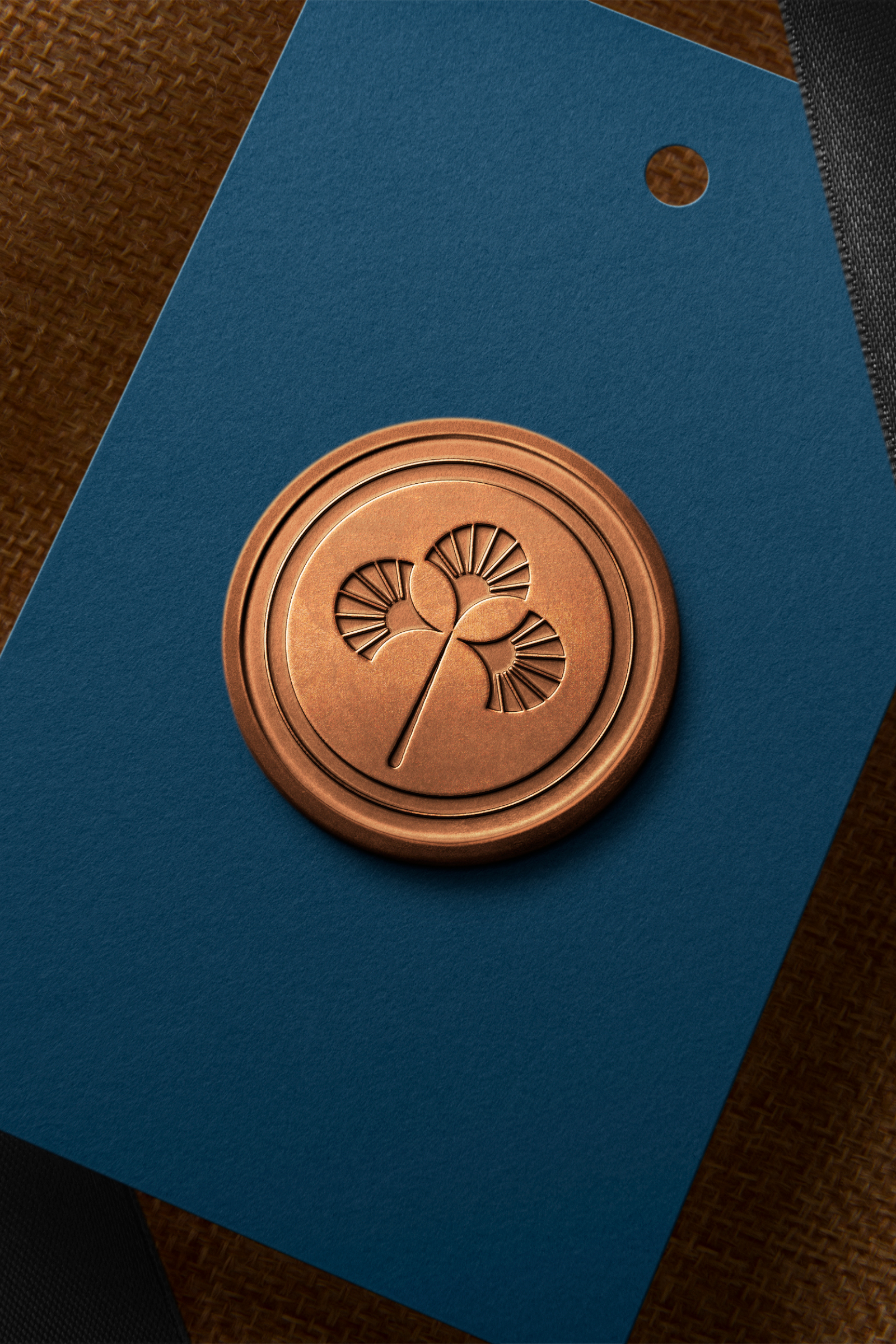
Saffron Collection immerses guests in welcoming, comfortable surrounds that are accentuated with curated touches that exude the brand’s genuine charm. To echo the brand tagline, ‘Collection of Compelling Stories’, all images must strive to tell an element of that story, through property, models and props.
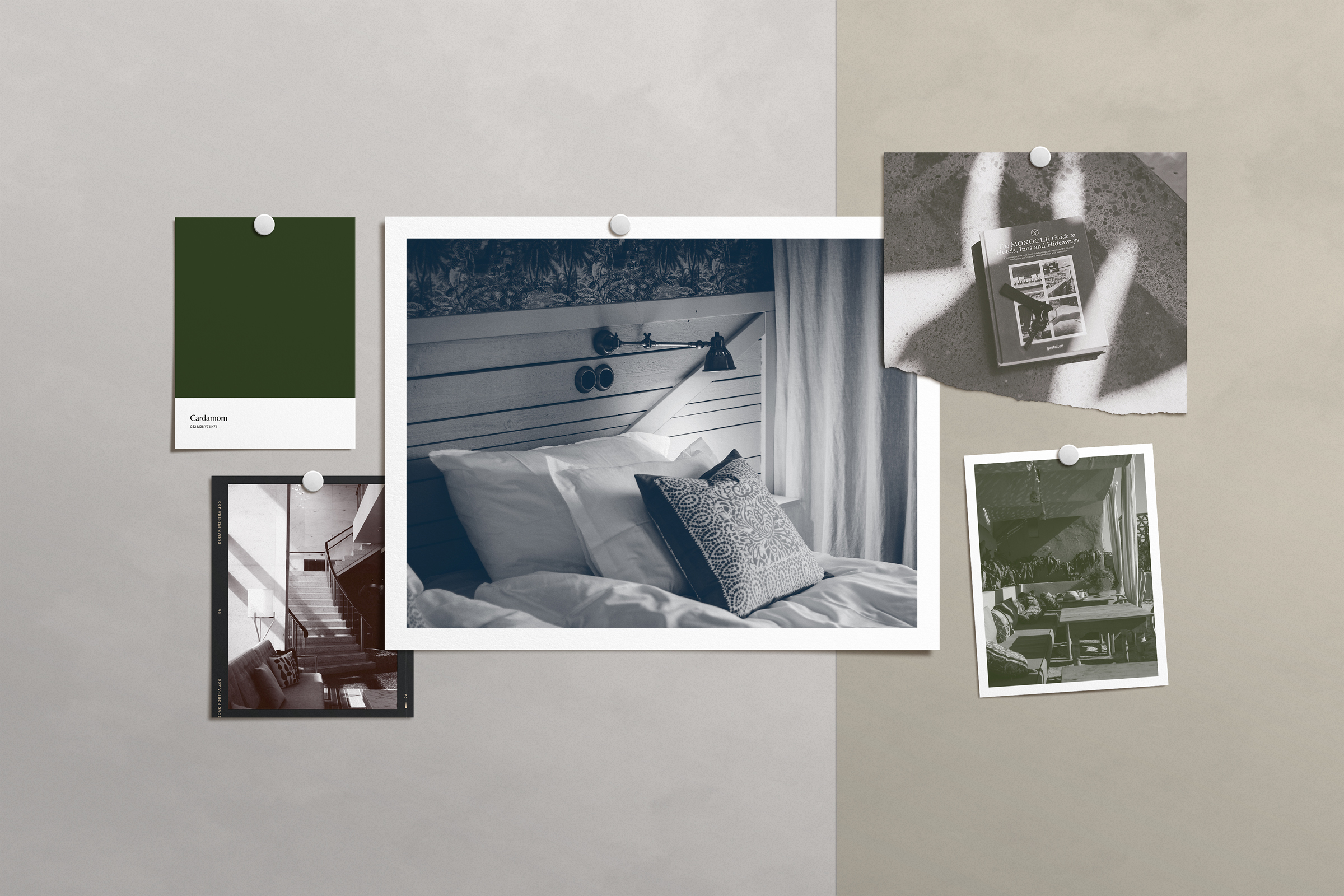
PHOTOGRAPHY TREATMENT
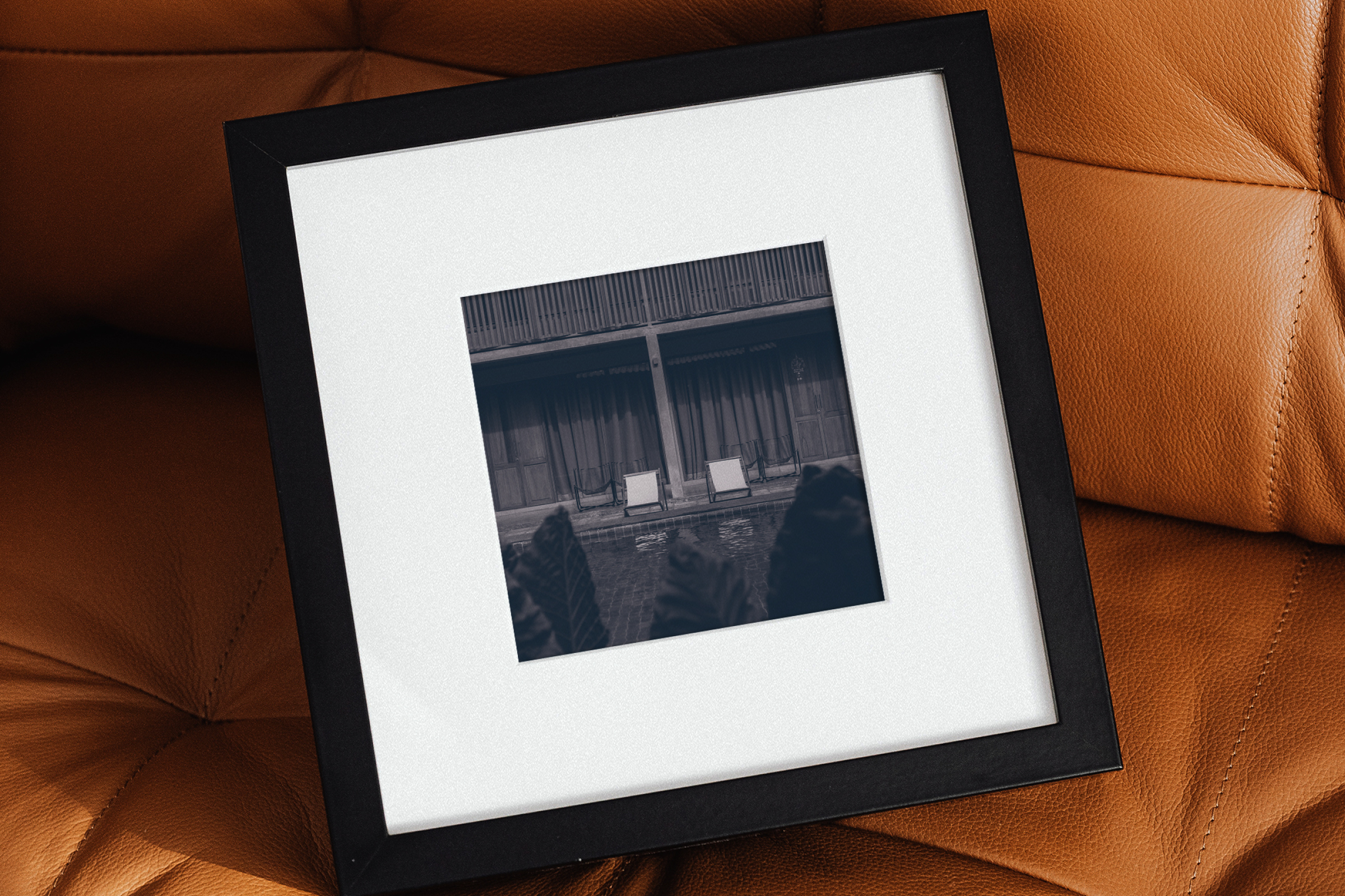
As Saffron Collection consists of various unique and individual properties, it can be a challenge to find a photography style that unites them all. By using a duotone “filter” effect from the brand Colour Palette, they can solve this and add additional elegance to the visual language.
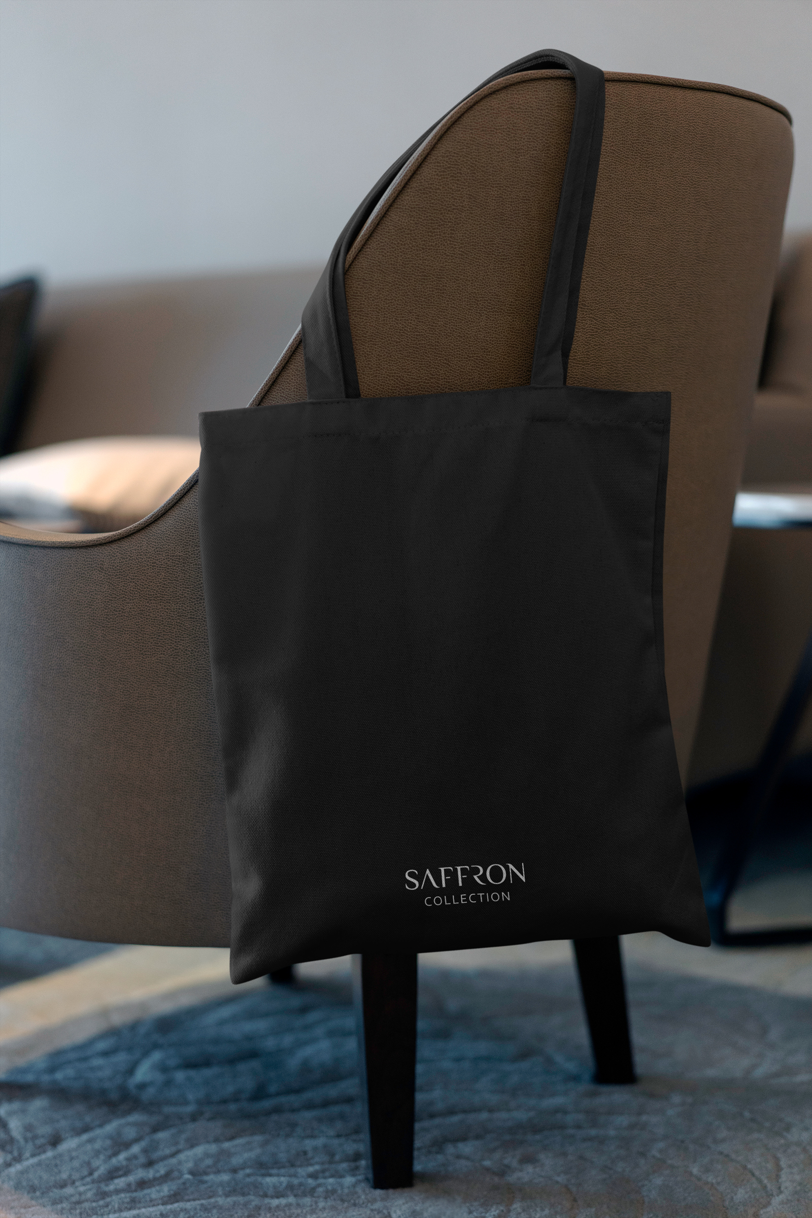
“At its core, Saffron Collection is a Collection of Compelling Stories. We captivate guests by providing the creative details and nuances that bring each of our hotels to life, making them personal, distinctive and memorable.”