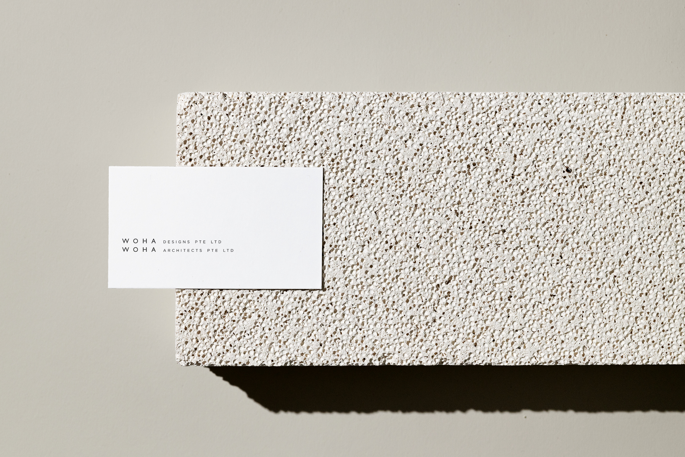
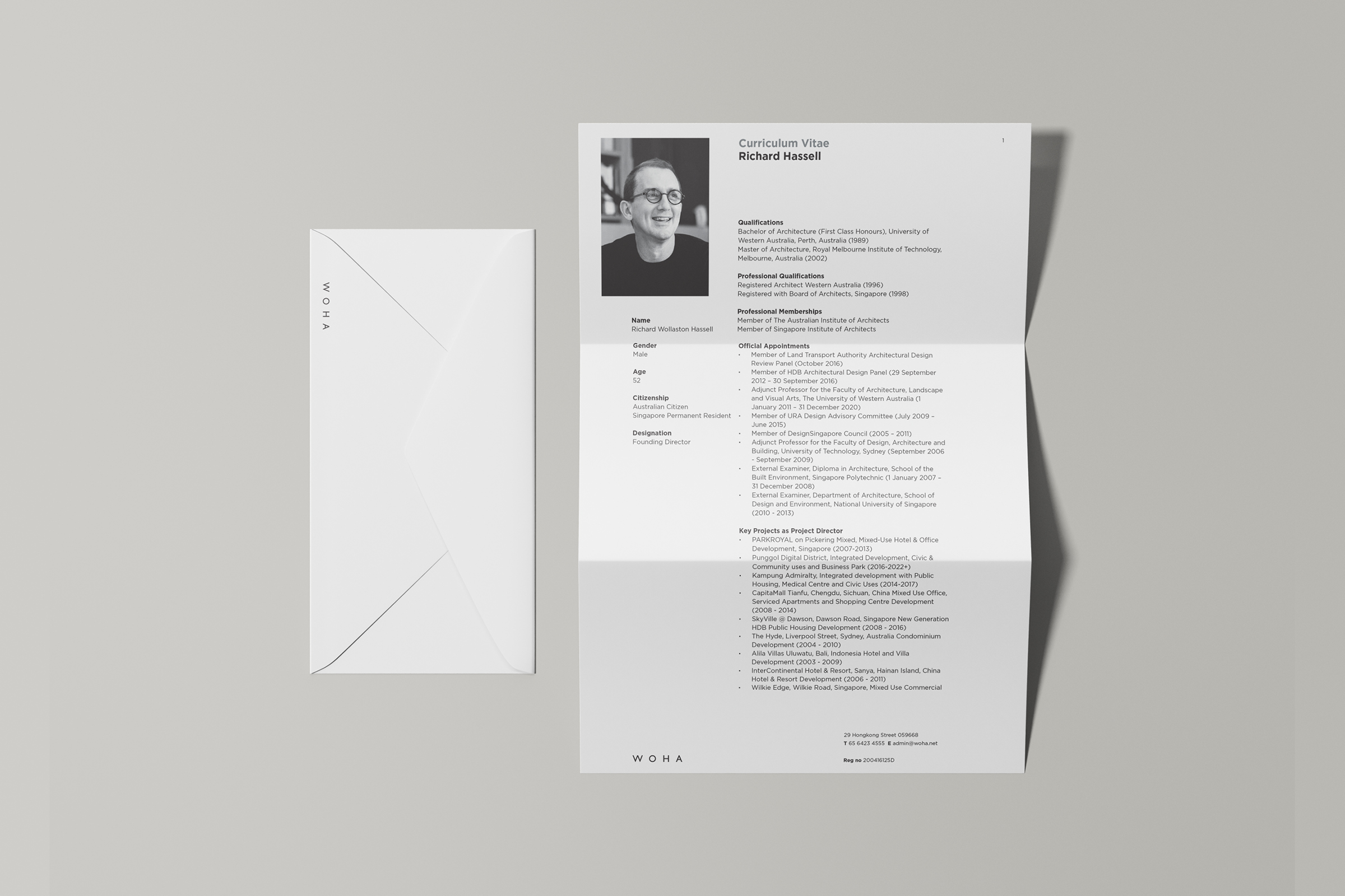
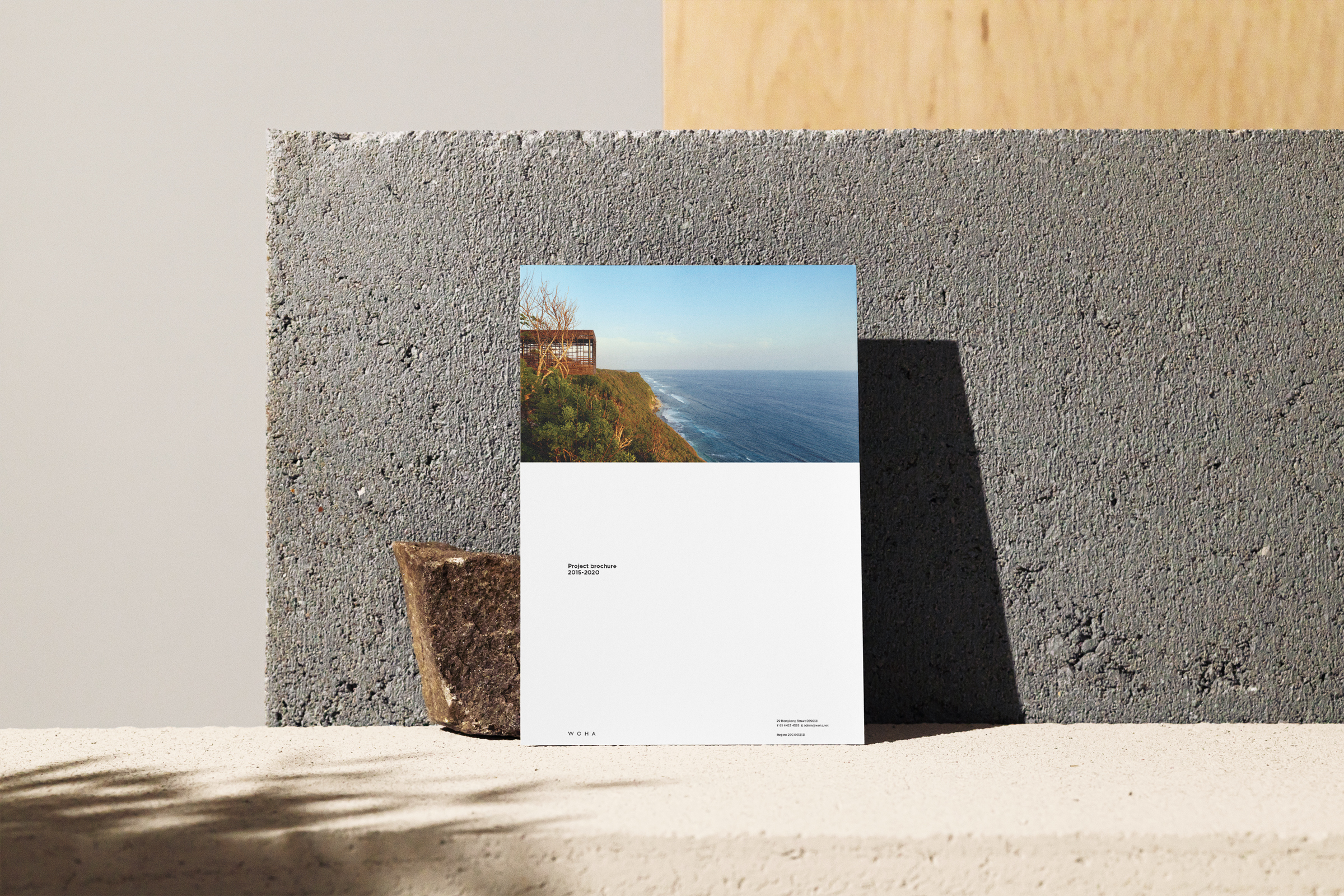
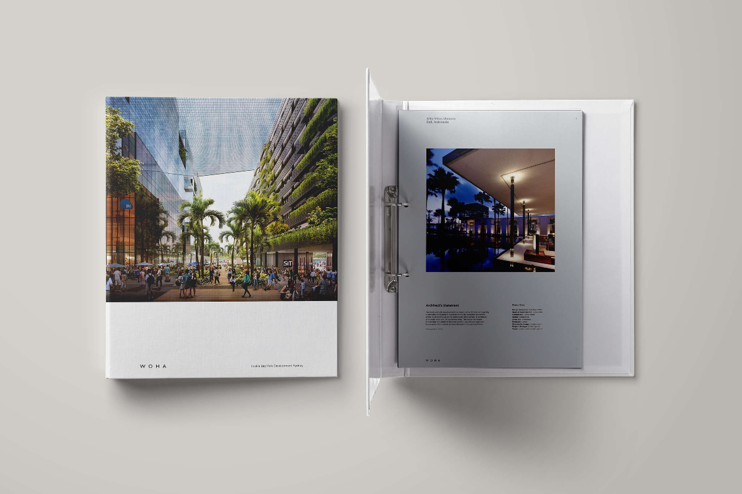
WOHA
Brand Identity
A brand refresh for WOHA — a Singaporean multinational architectural industrial design firm.
WOHA is a Singapore-based practice focuses on conceiving integrated architectural and urban solutions to tackle the problems of the 21st century such as climate change, population growth and rapidly increasing urbanisation.
WOHA has been a leading force in developing sustainable built environments - in fact their key projects stand as reference points for the industry as a whole.
Their internal culture has been geared towards finding better solutions to address the problems of the contemporary built environment and in a way, have become ‘known’ for this approach to their work. However, it has now become topical and most architectural firms make similar (if not exactly) the same claim - making differentiation is a communications issue for WOHA.
Credits
Brand strategy
Colin Anderson
Creative direction
Chew Kok Hsiung
Brand design
JY Foo
Project management
Florian Lüthi
Collaboration
Yolande Leong
"WOHA believes good design must arise from this thoughtful process of study and research, which is combined with technical knowledge, social and political understanding, then synthesised through creative skill and artistic judgement."
BRIEF
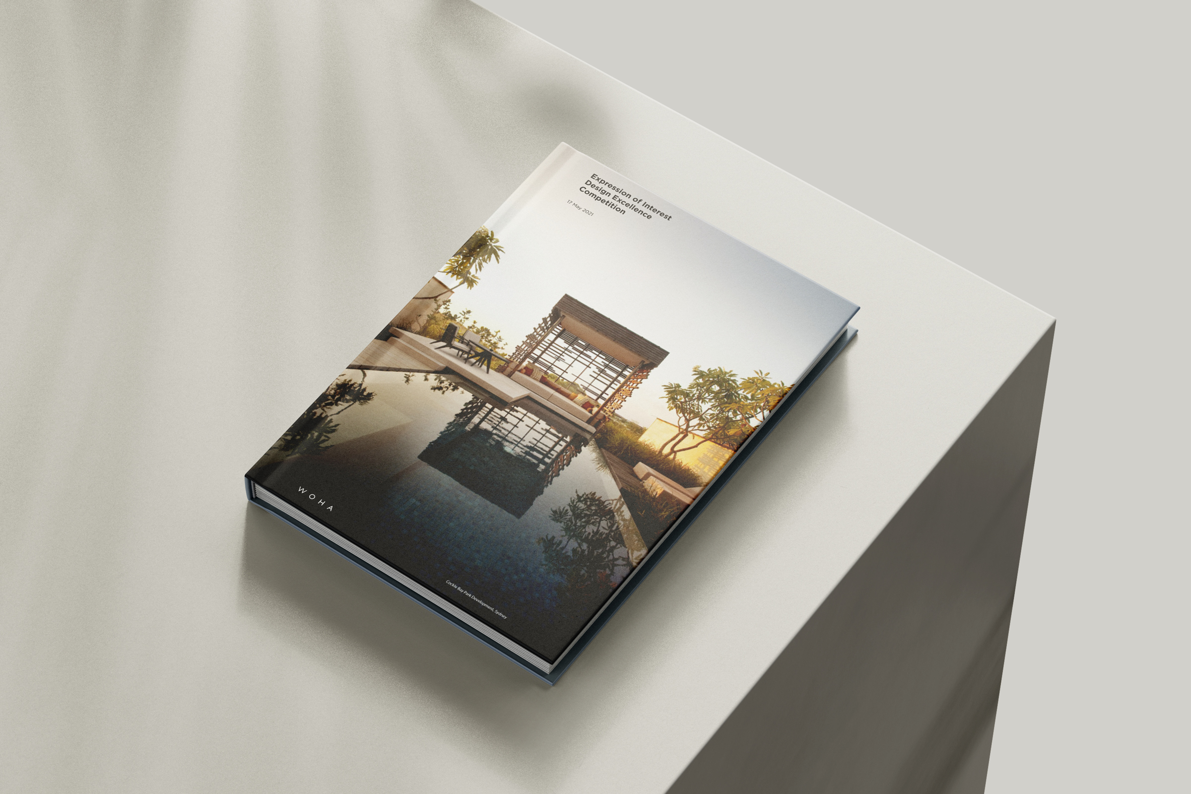
To tighten and refresh WOHA’s visual language and to make sure that the current style is tweaked rather than changed. It shall be a brand refresh exercise, that’s ‘evolution’ rather than ‘revolution’.
RESPONSE
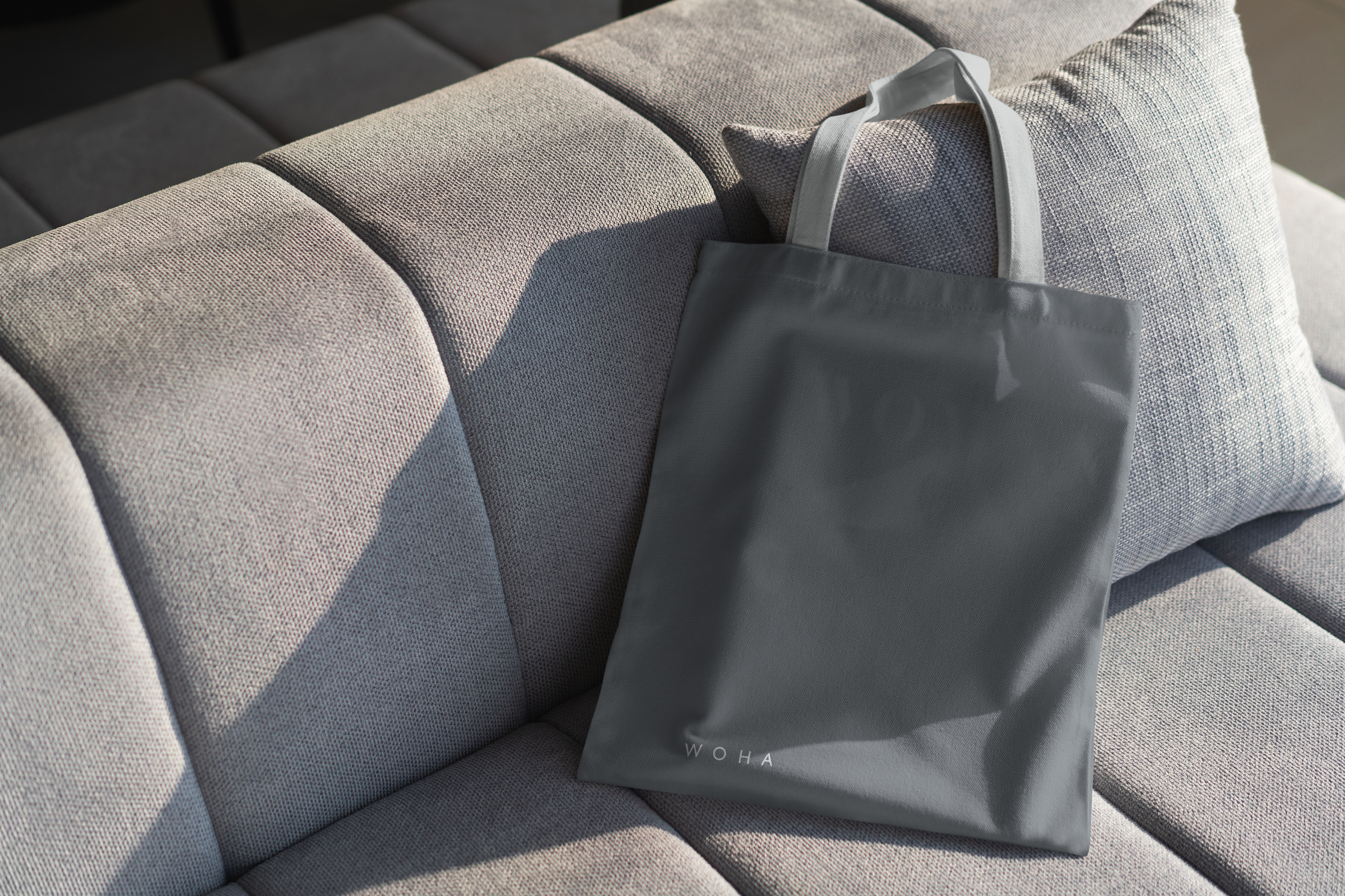
To create a whole suite of templates, which will help the team at WOHA to work consistently and therefore to be much more ‘on brand’ and to be able to communicate effectively on all levels with their various stakeholders. At the same time, this is an excellent opportunity to look at the way in which WOHA is positioned vis-a-vis other industry leaders.